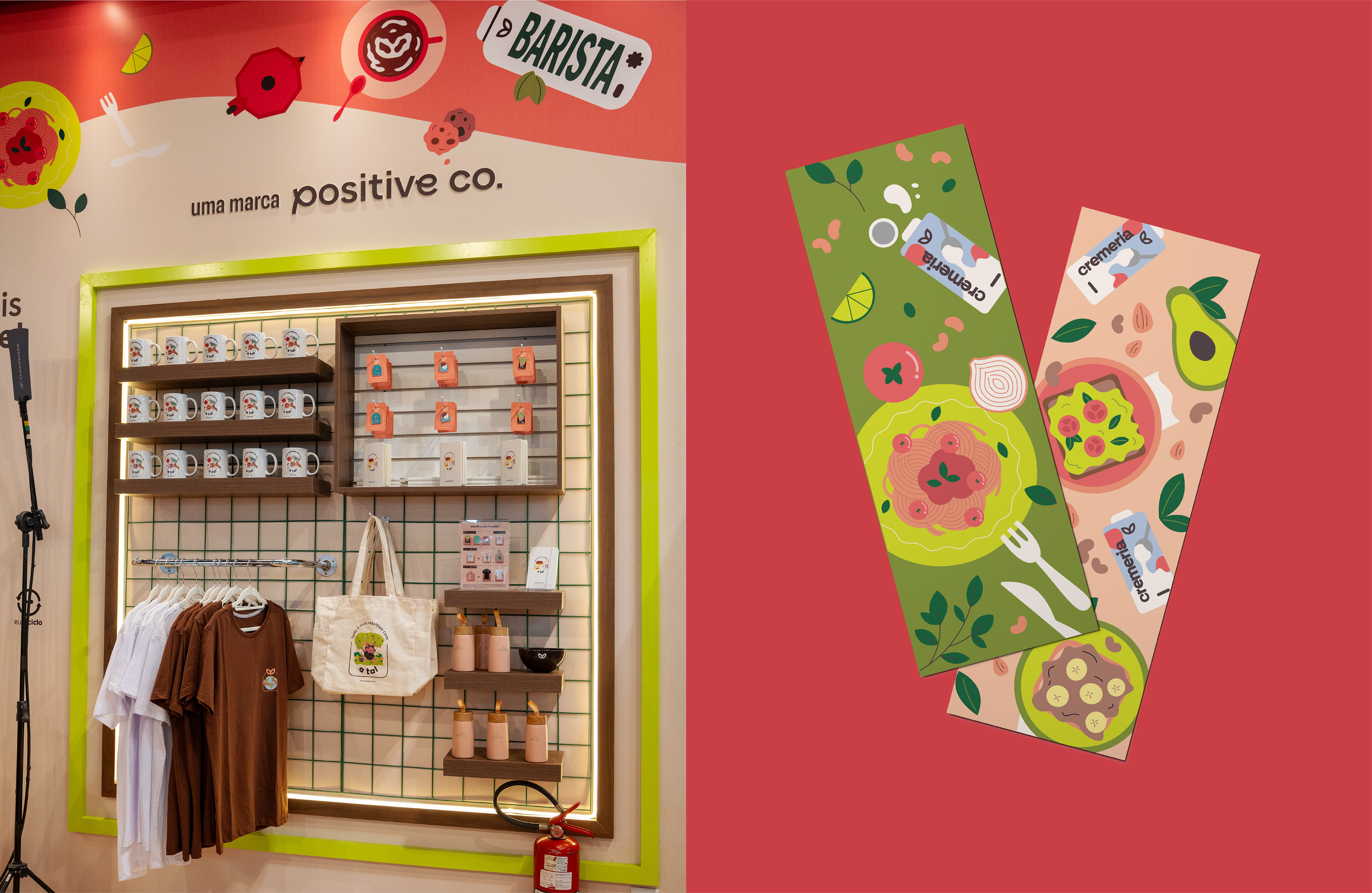
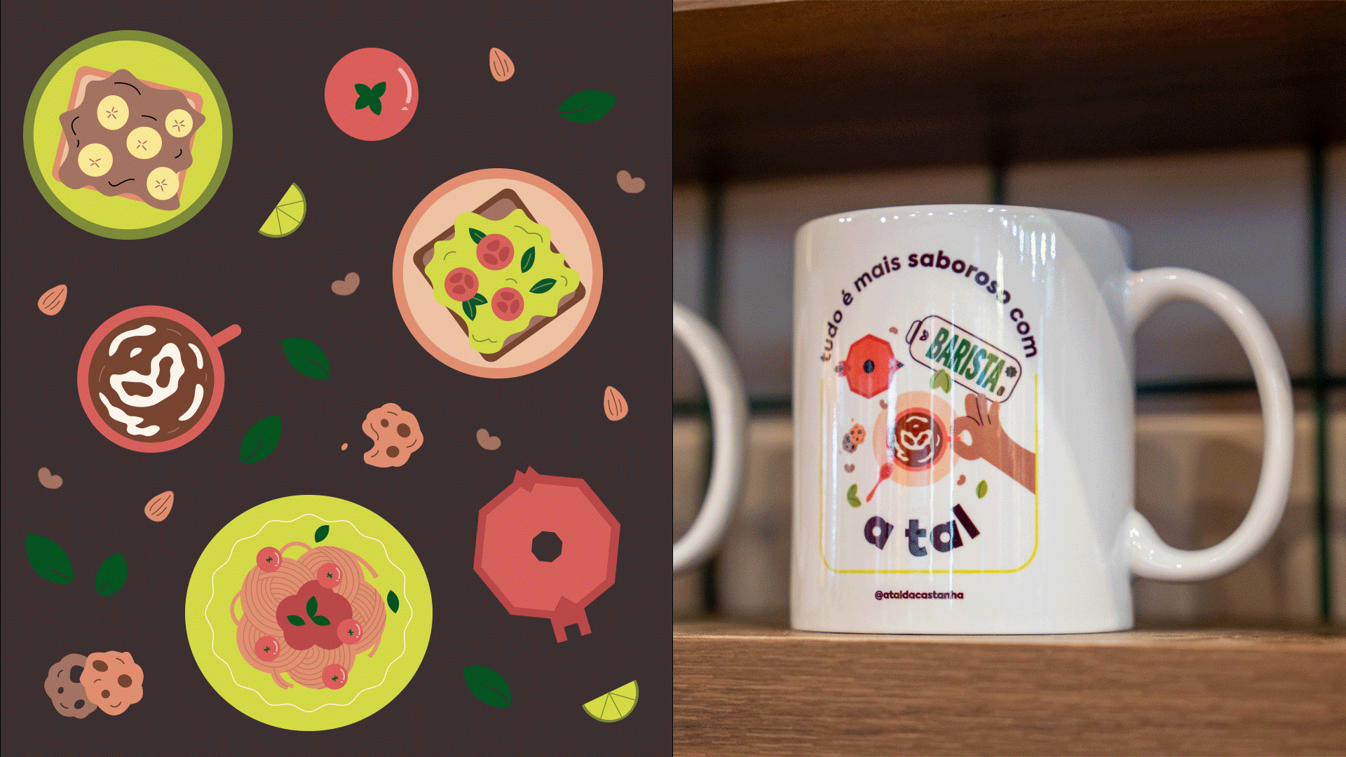
Client: A Tal da Castanha / Positive Company
Design: Lorrine Sampaio
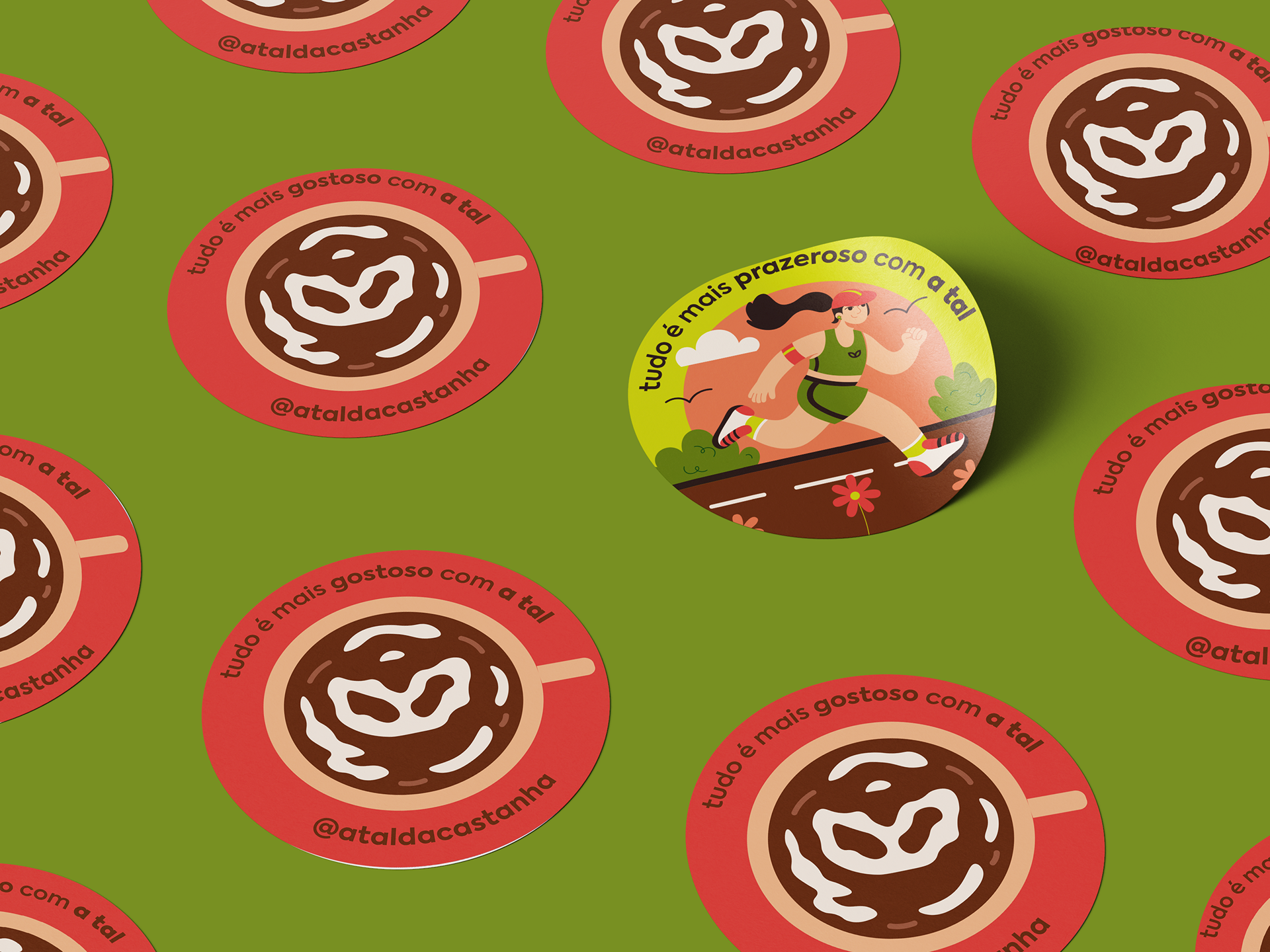
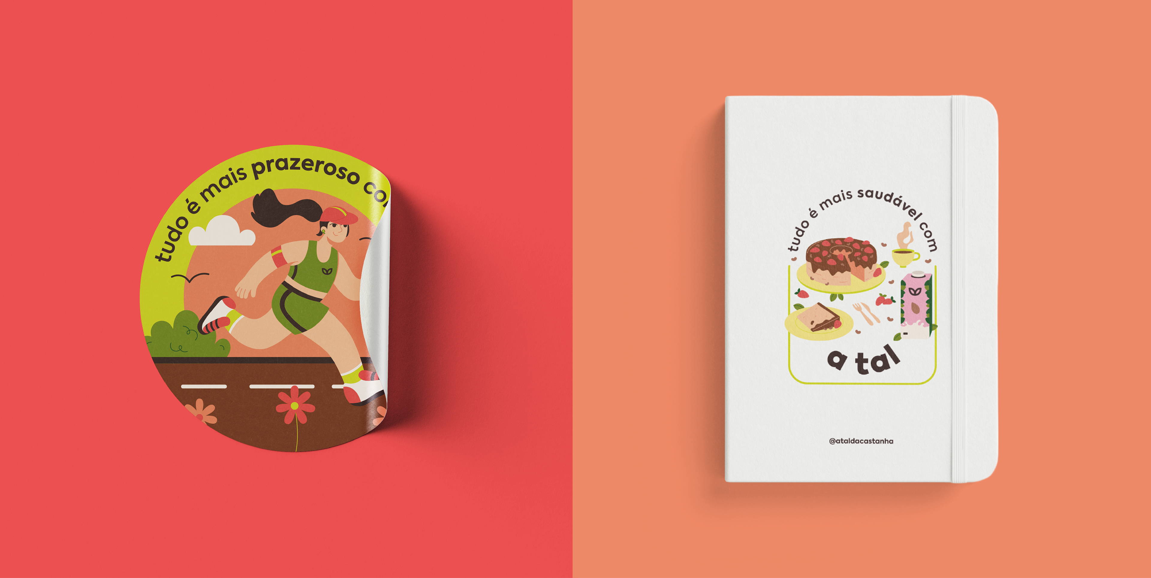
Illustrations: Tatyane Frankalino
Design: Lorrine Sampaio
Illustrations: Tatyane Frankalino
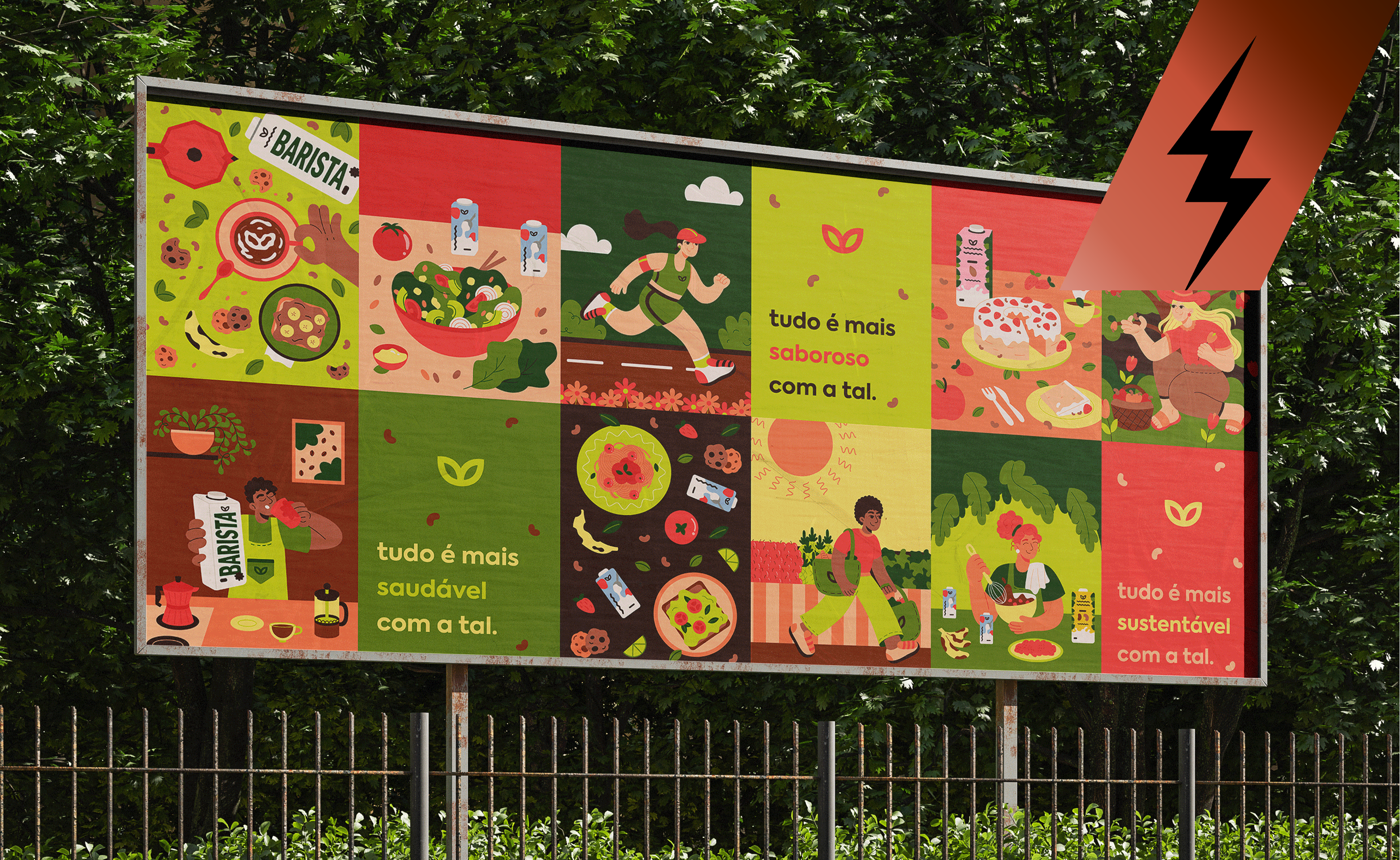
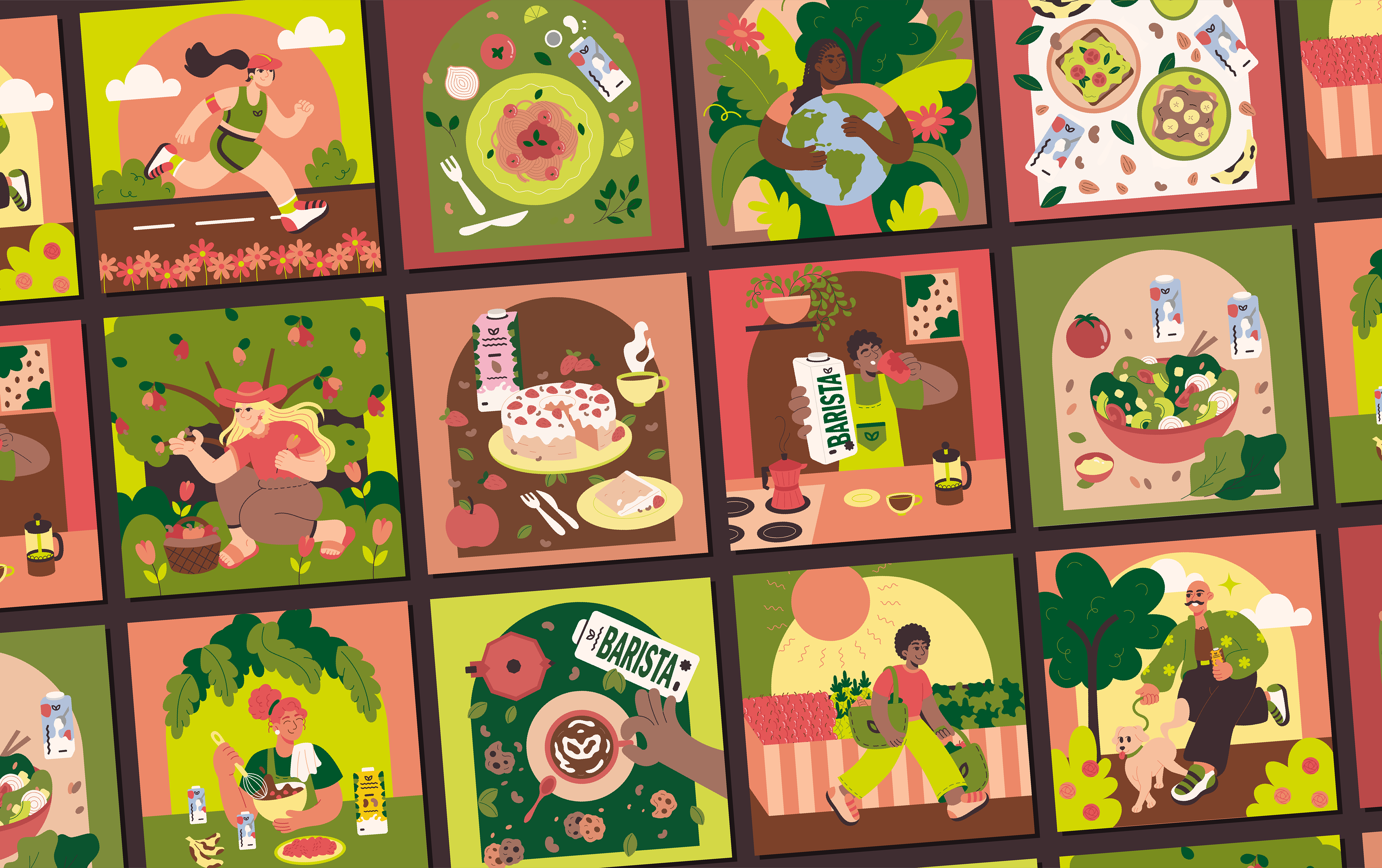

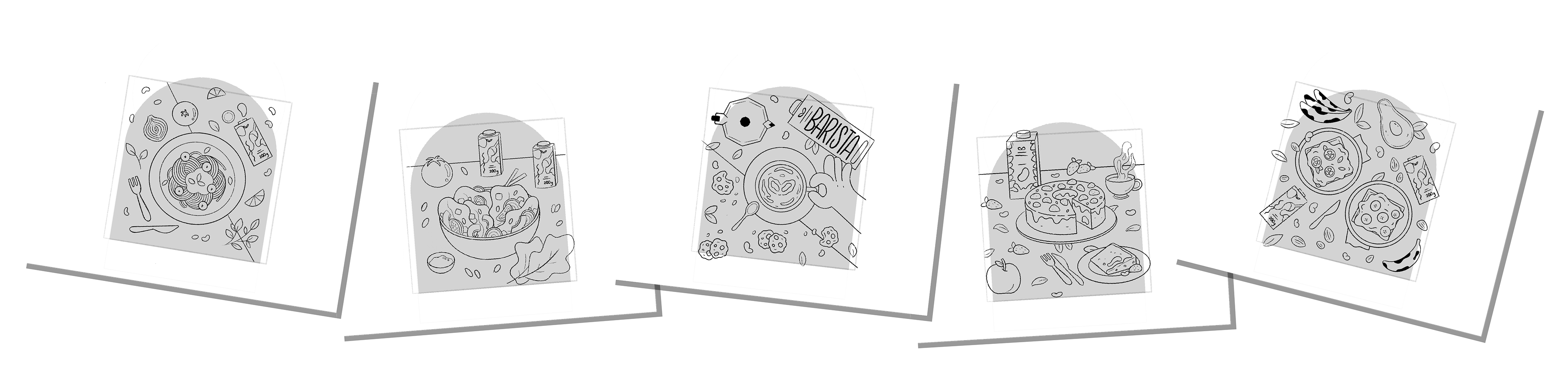
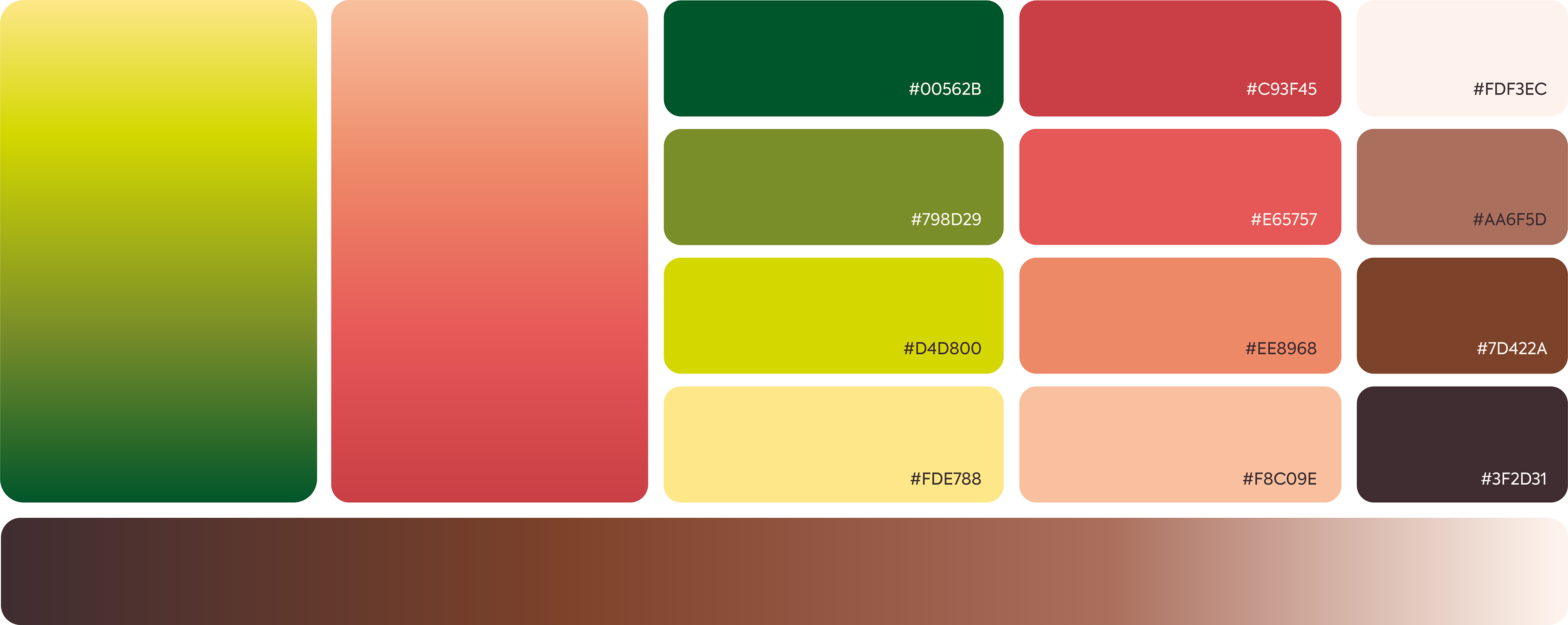
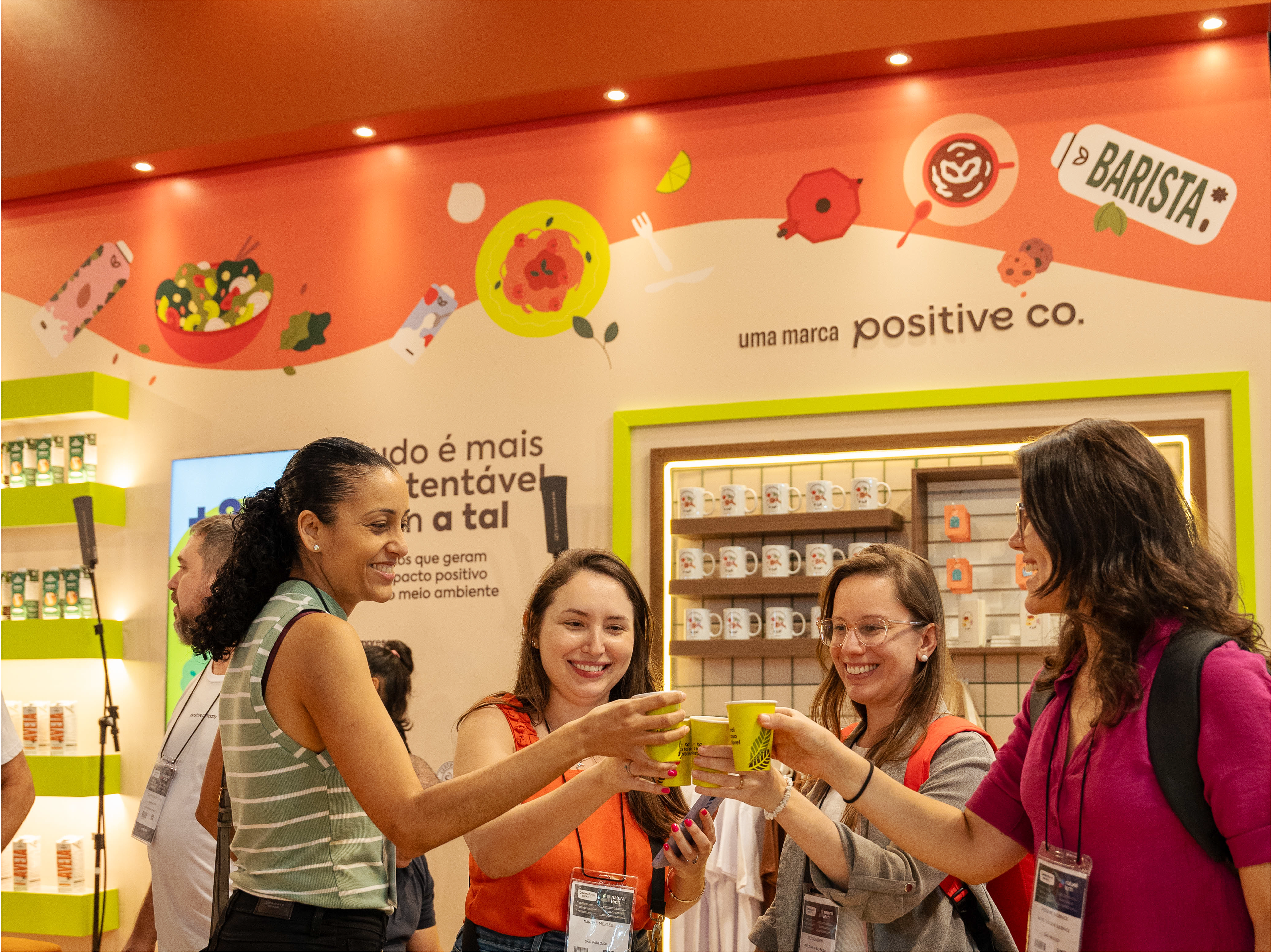
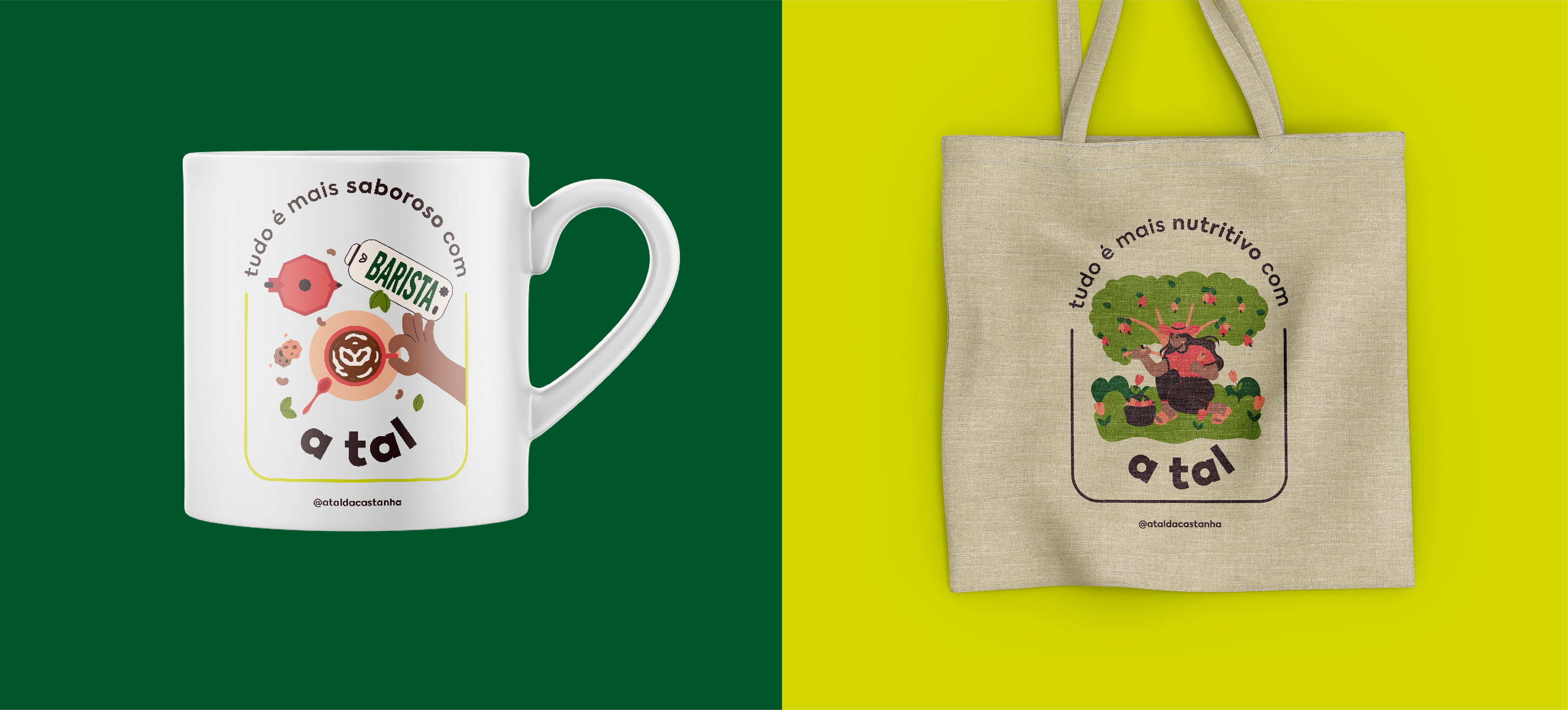
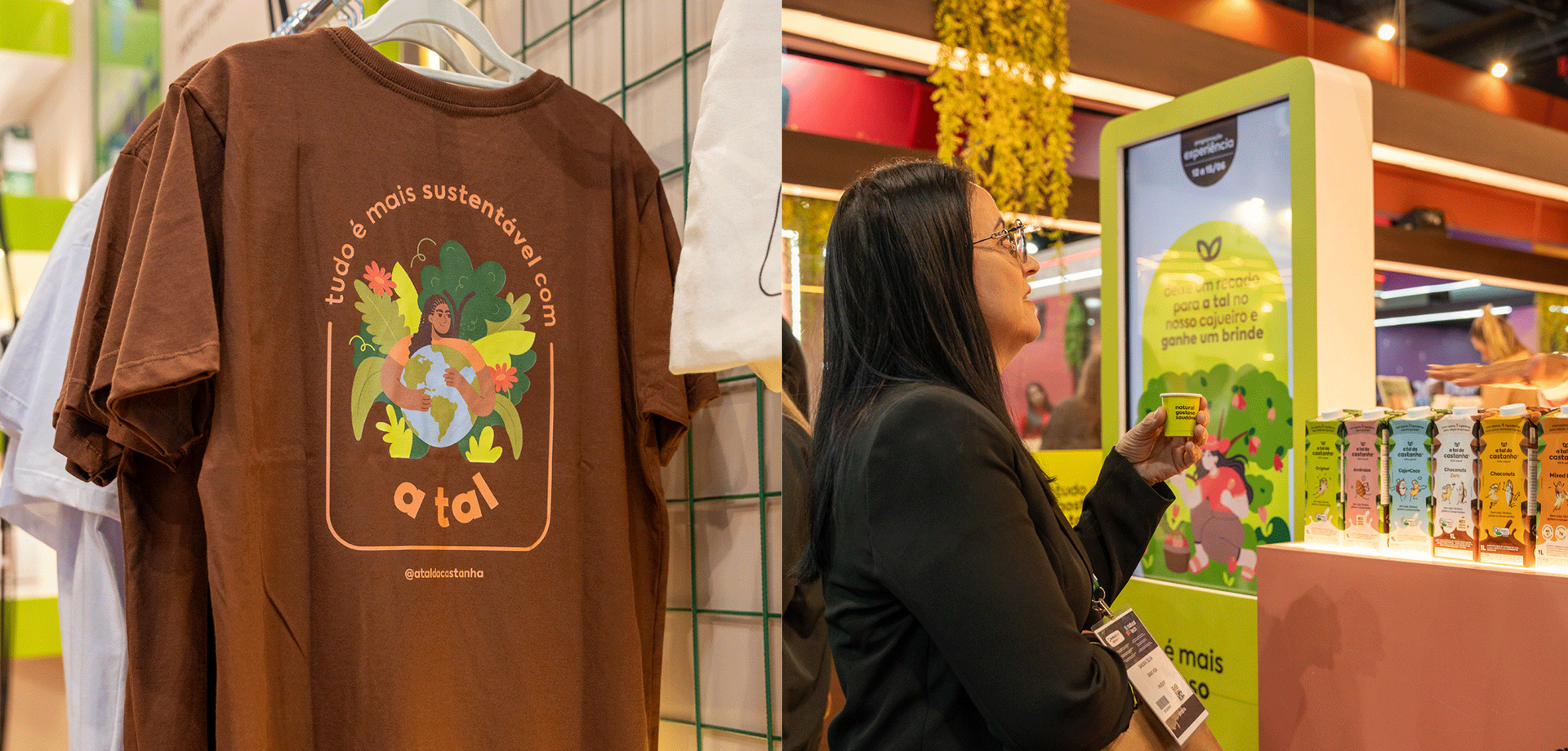
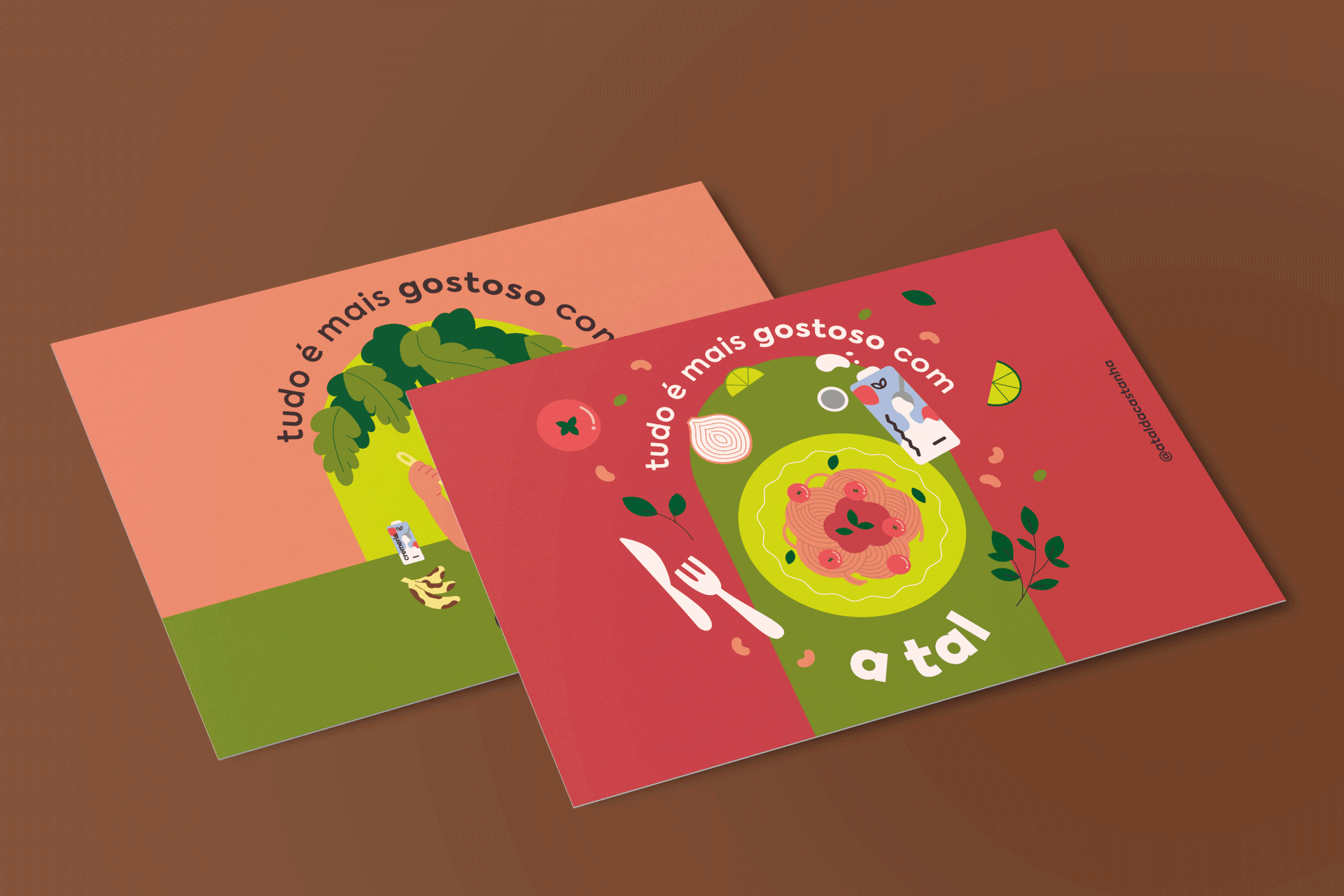
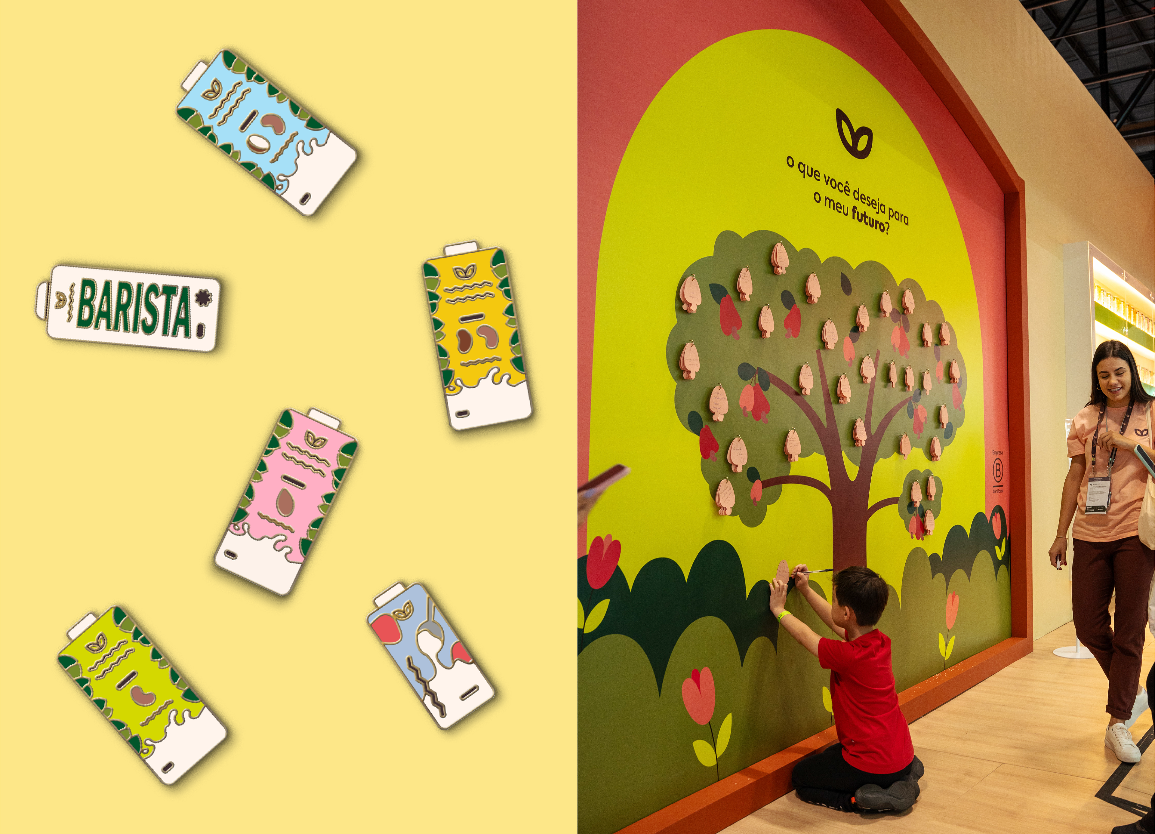
For the illustrations, it was important to translate the brand's ideals and values, as well as showing how its products fit into people's daily lives and can be transformed into delicious and healthy foods and moments. The color palette features a chromatic scheme inspired by nature, starting from the brand's usual colors and expanding the palette to allow for greater diversity and possible applications. The illustrations were also designed to be worked on in different ways, with separate elements that can be applied in different compositions and at different scales based on the needs of Tal's design team, so vector illustrations were the best choice.